ReFIND
The social marketplace for second-hand style.
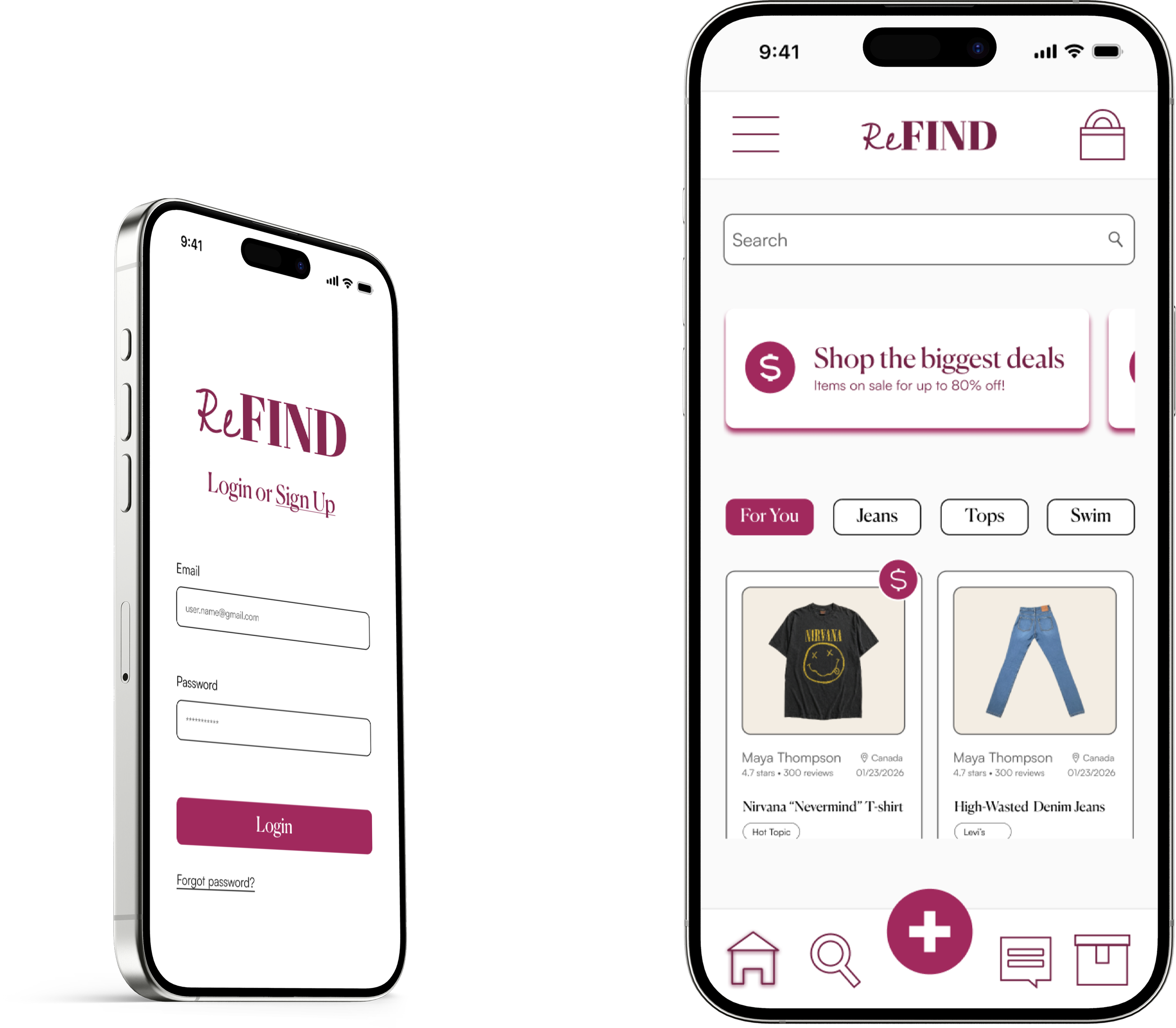
SUMMARY
ReFIND is a Sheridan College Digital Product Design project in the Prototyping & Workflow Methods class. The project involved designing any kind of interactive prototype with two user flows.
-
Designer
-
14 Weeks
-
Figma
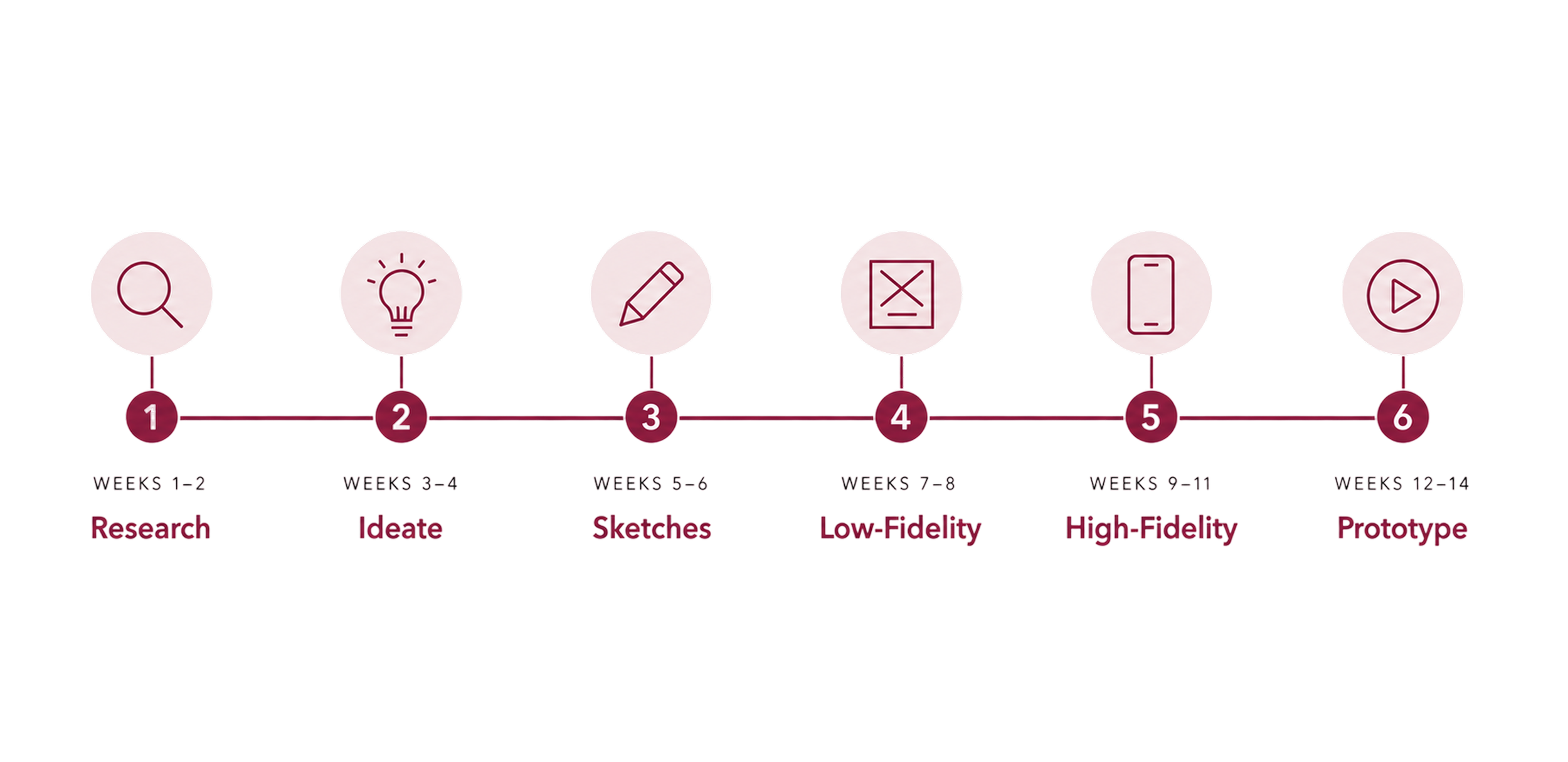
TIMELINE
THE PROBLEM
How might I create a thrifting app that focuses on discovery, sustainability, and community?
RESEARCH INSIGHTS
I focused on understanding the motivations behind thrifting culture so the product could communicate value beyond simply buying and selling clothes. Through second-hand research, I identified three major drivers to shape the communication goals of the app.
Affordability & Value
1
Thrifting lets shoppers buy clothing at lower prices while finding higher- quality or valuable items, helping them justify their purchases and save money.
Ethical & Sustainable Values
2
People thrift because it aligns with their environmental and moral beliefs against fast fashion brands and clothing waste.
Self Expression & Social Culture
3
Thrifting enables individuals to find unique clothing, express their identity, and feel connected to a community of people sharing similar values and interests.
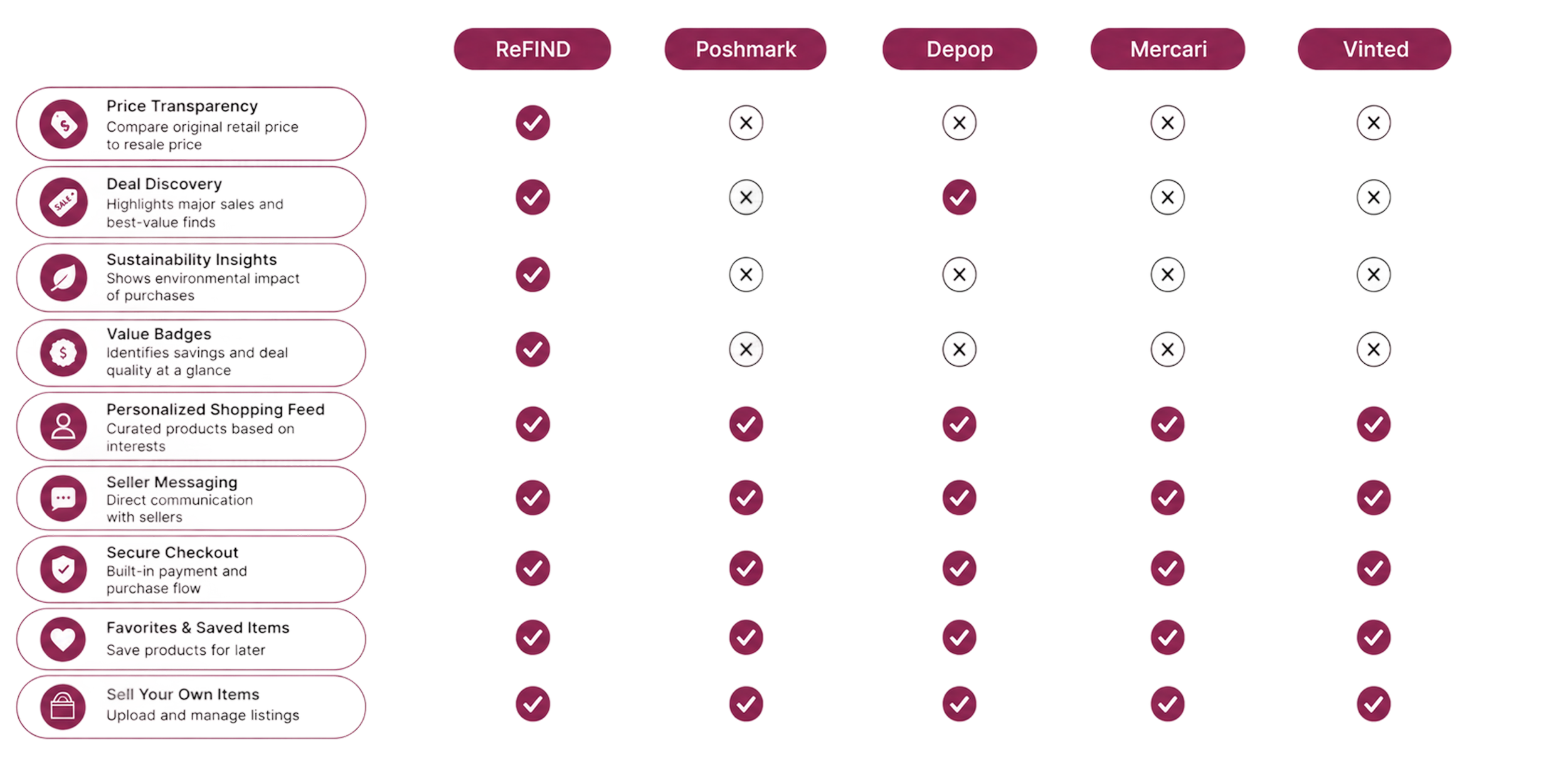
COMPETITIVE ANALYSIS
I performed a competitive analysis to identify features that would make the app unique and stand out. Demonstrating price transparency, deal discovery, and sustainability insights through badges sets ReFIND apart.
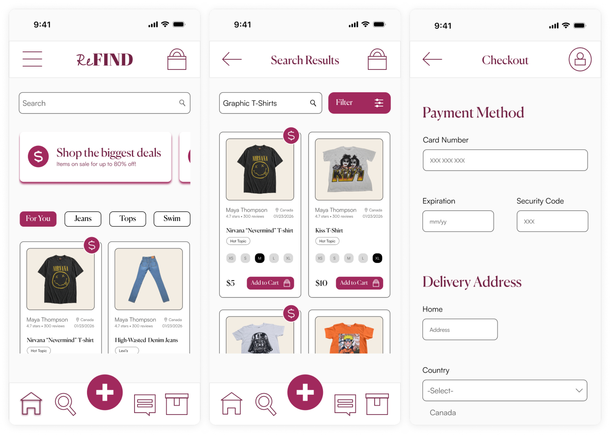
USER FLOWS
I created primary and secondary user flows that reflected how people shop and sell second-hand clothing online.
PRIMARY FLOW
I prioritized the user by structuring the primary flow around finding and purchasing unique second-hand items with ease. The flow moved from browsing to checkout ensuring users could easily search for products, view details, communicate with sellers, and complete purchases. The flow includes messaging because trust and interaction are important in thrifting culture.
SECONDARY FLOW
For the secondary flow, I simplified the selling experience by organizing the process into clear, manageable steps — uploading photos, adding details, posting the listing, and receiving confirmation — so users could place unused clothing into listings without feeling overwhelmed.
UI KIT
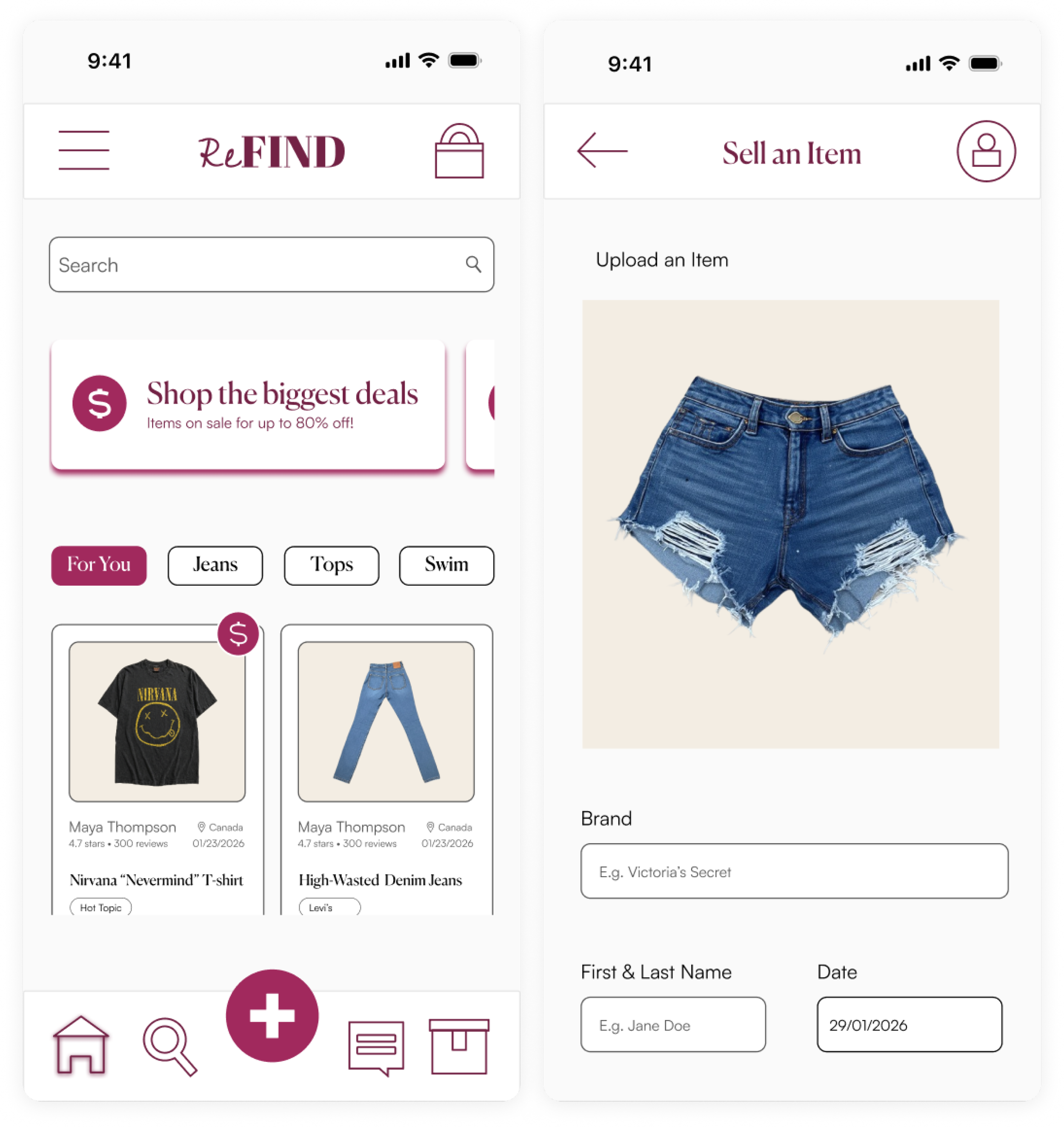
I created a visual system of icons, buttons, forms, a colour palette, and typography to effectively communicate both user flows (buying and selling). The final UI kit created a strong visual narrative balancing brand personality with usability. Hierarchy, colour, typography, and interaction design easily guided users through the app and reinforced its identity as a modern, community-driven thrifting platform.
ICONS & BUTTONS
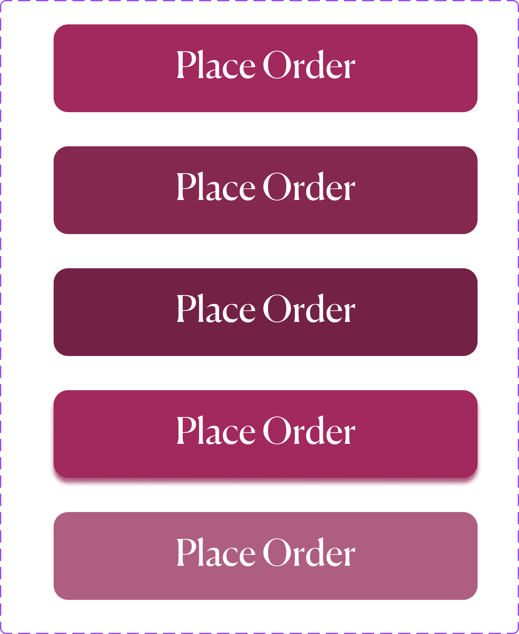
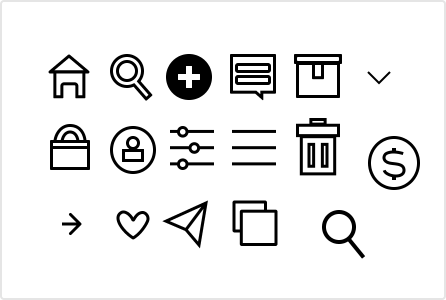
I designed consistent icons, and forms and buttons with the same typography, spacing, and colour to guide users through searching, purchasing, and selling items.
COLOUR PALETTE
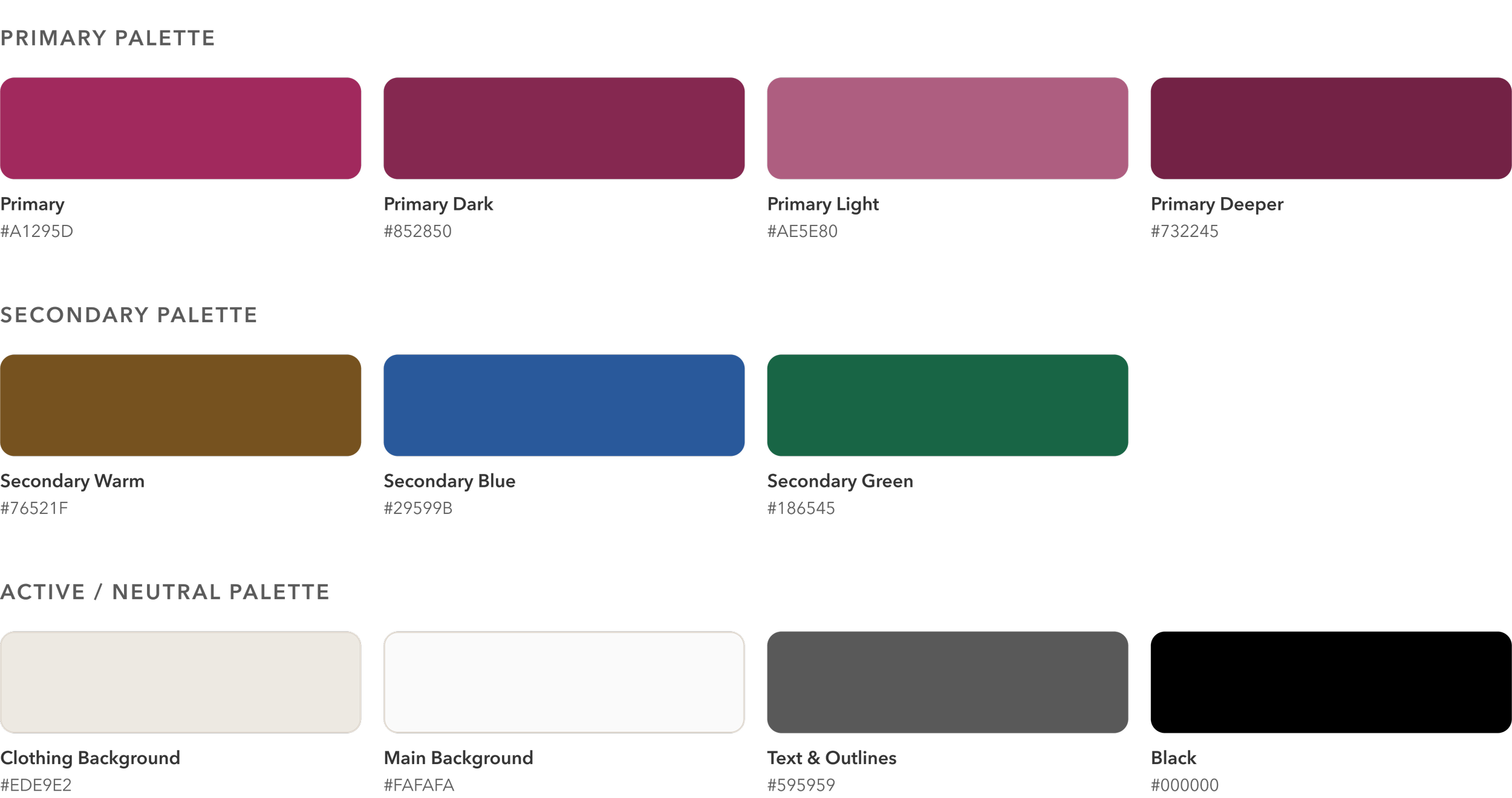
I created a colour system with primary, secondary, and active palettes. Deep rose tones reinforced the brand identity and button states, neutral backgrounds emphasized product imagery, and active colours communicated approvals, warnings, errors, and typing states.
TYPOGRAPHY


I used six heading and three body text variations to establish a clear information hierarchy across screens and a distinction between primary actions, product information, and supporting details. I selected Canela for headings to create a fashionable and editorial feel reflecting the individuality and curated nature of thrifting culture. Satoshi provided clean readability for body text and form interactions.
PROTOTYPE
I translated the research insights and UI kit into a full user experience. The prototype maintained consistent visual identity, tone, and interaction style using the UI kit. I ensured the messaging and layout aligned with the emotional experience of thrifting. Product browsing screens emphasized discovery and individuality, while selling flows were designed to feel simple, welcoming, and community-driven. Notification banners, button labels, and interface copy maintained a supportive and conversational tone that reflected the sustainable and peer-to-peer nature of the platform. Consistency in spacing, hierarchy, icon usage, and navigation patterns helped create a seamless experience that felt recognizable across every part of the app.
Through secondary research and iterative design, ReFIND addressed the key barriers that make secondhand shopping feel fragmented and unreliable. The final prototype combined buying and selling into one streamlined marketplace, allowing users to browse, list items, message sellers, and complete purchases within a consistent experience. By prioritizing trust, simplicity, and community, the design made sustainable shopping feel more approachable for everyday users.
RESULTS
Translated research into features that addressed users' motivations for affordability, sustainability, and self-expression.
Designed complete buying and selling user flows for a mobile marketplace.
Created a scalable design system, including typography, colour palette, and reusable UI components
Developed an interactive Figma prototype demonstrating key marketplace interactions.
PROJECT OUTCOMES
Key Takeaway