MyFitnessPal
An inclusive redesign that transforms wellness planning.
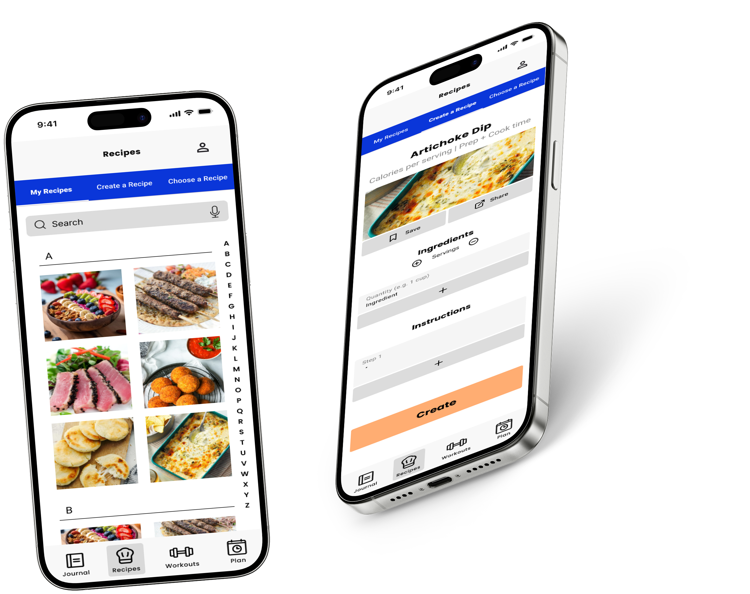
SUMMARY
The redesign of MyFitnessPal is a Sheridan College Digital Product Design project in the Inclusive Design class. The project involved improving the user experience of a pre-existing app by making it more accessible.
-
Designer
-
14 Weeks
-
Figma
TIMELINE

THE PROBLEM
How might I re-design the pre-existing MyFitnessPal app to improve accessibility, usability, and inclusive design for a broader range of users?
USER RESEARCH
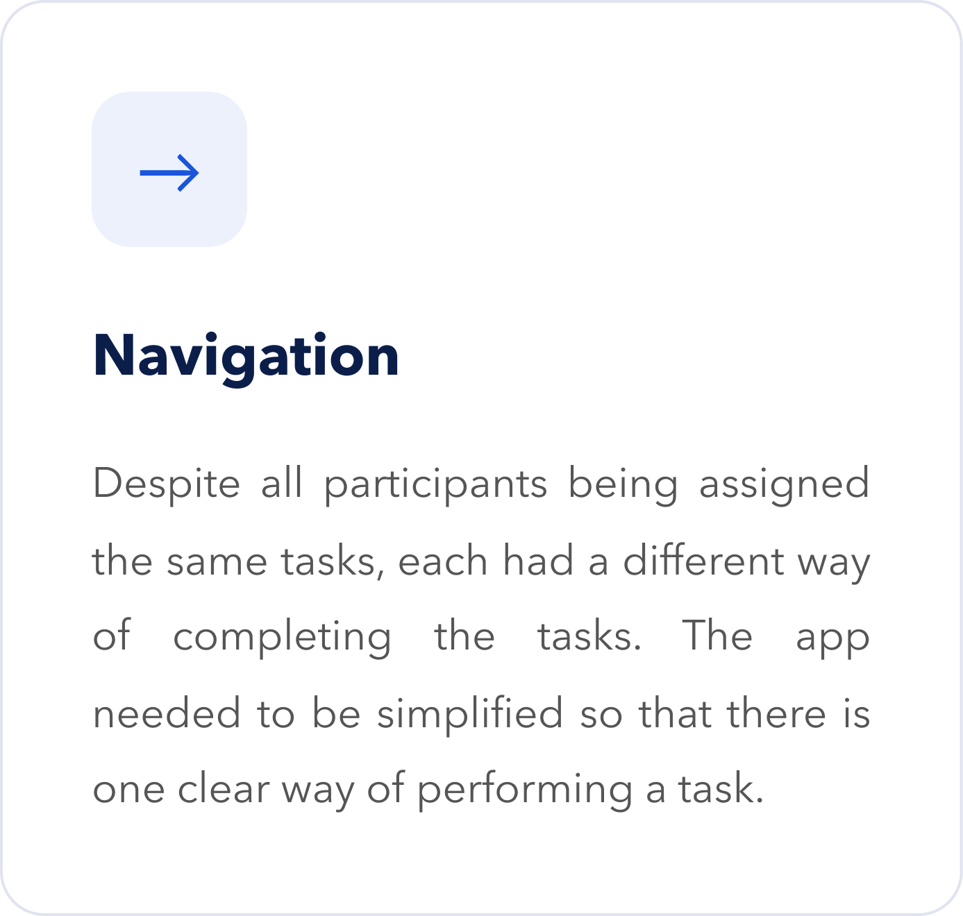
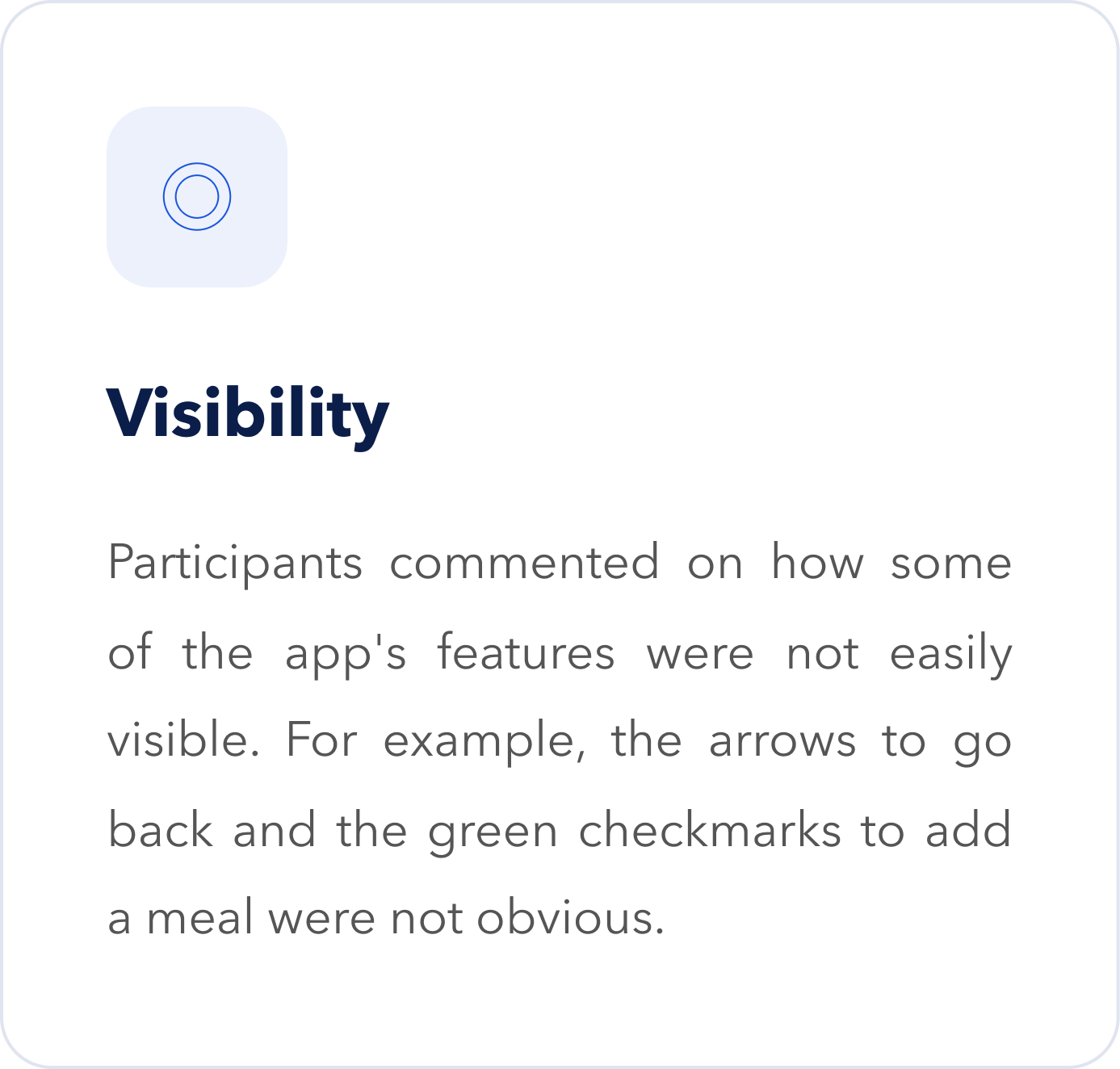
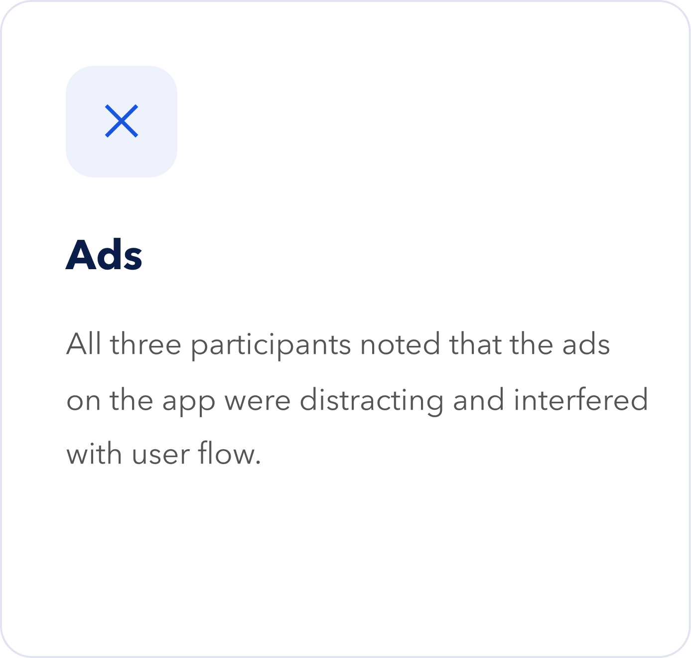
I conducted an audit to determine major issues so that the project has a clear strategic direction on how to improve the app. There were three key findings that emerged from the audit.
USER PERSONA
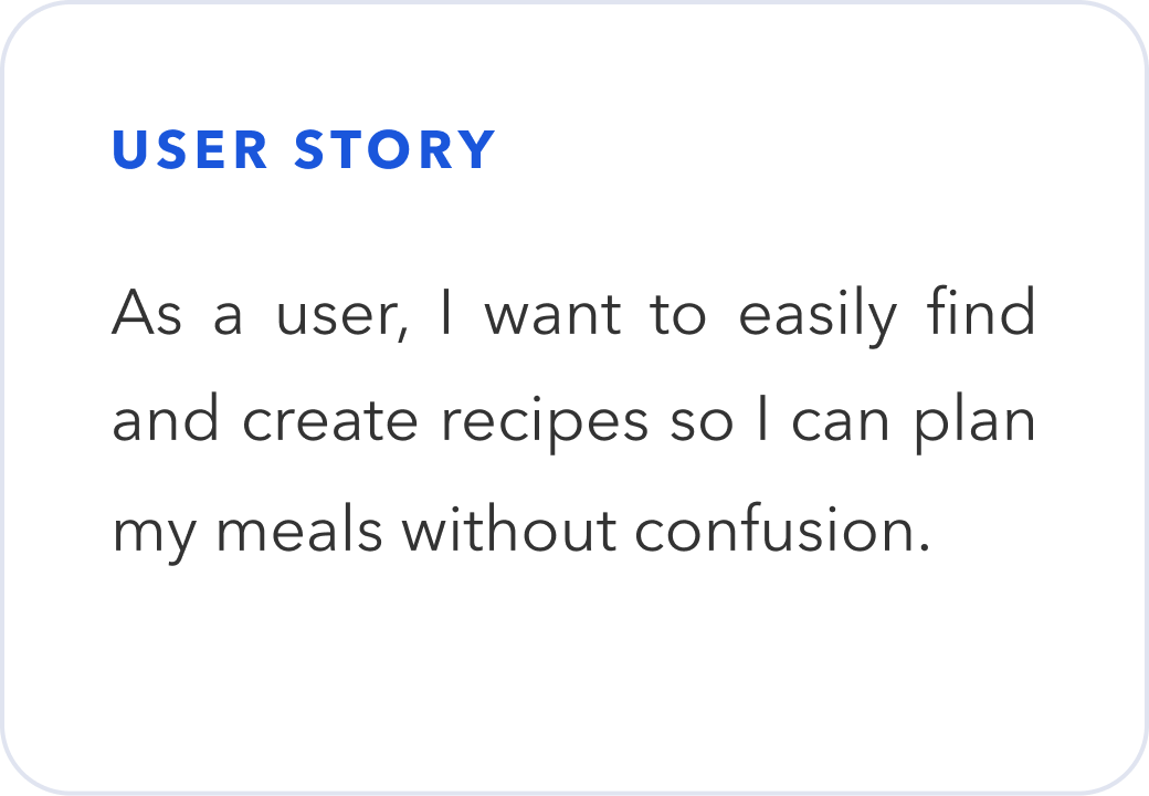
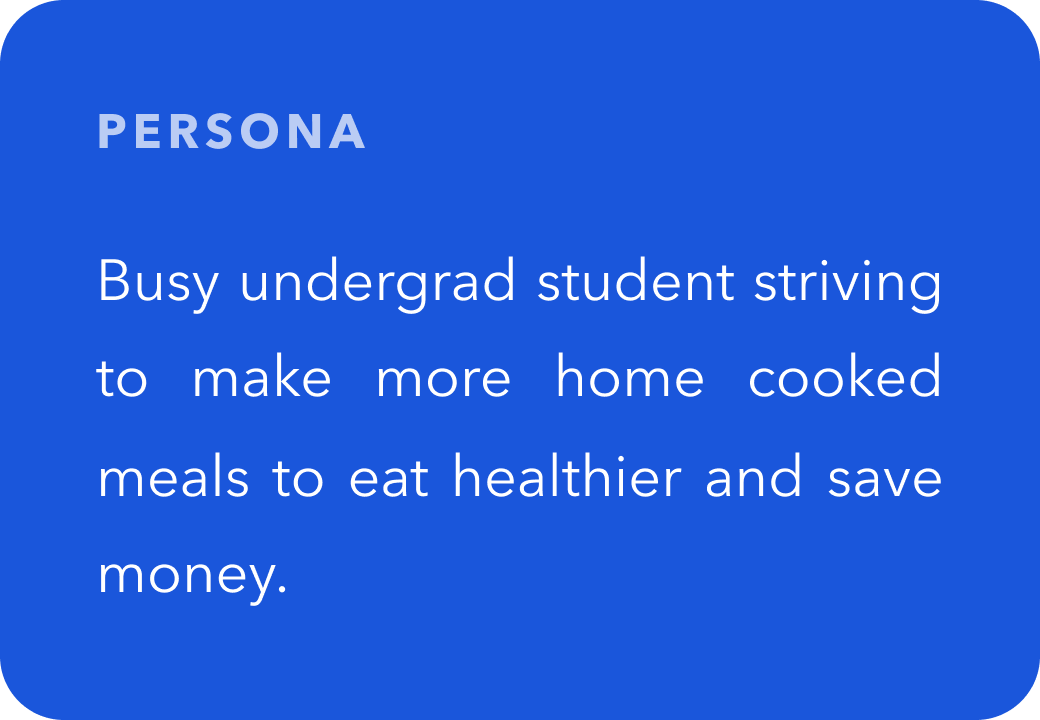
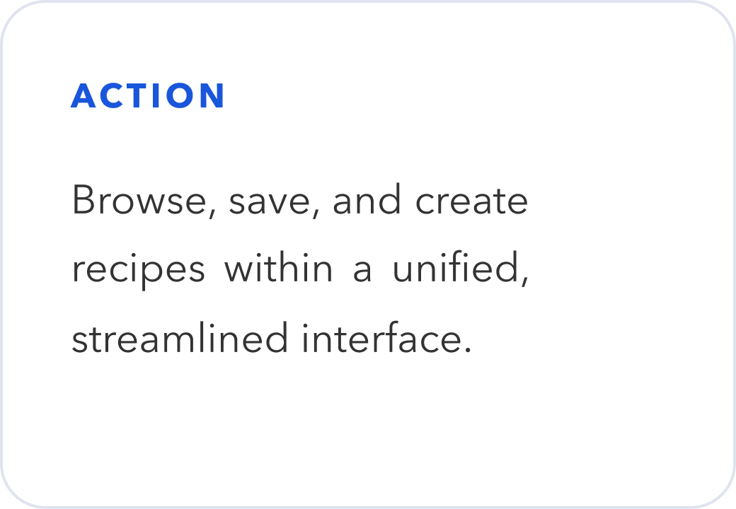
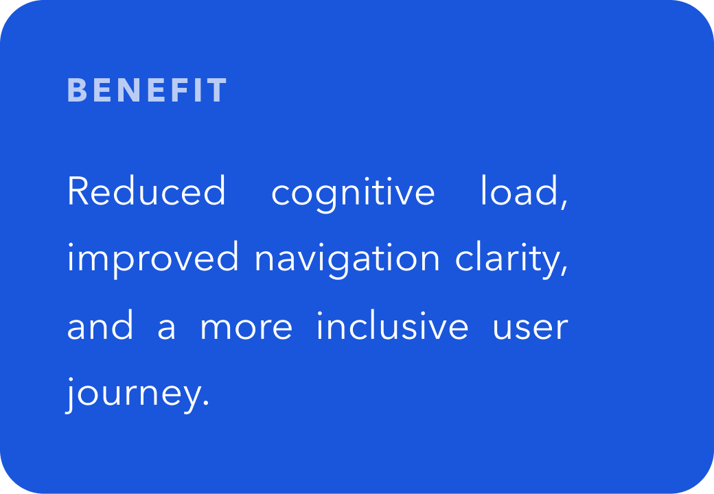
I framed my design solution by creating a user persona that highlights the user story, action, and benefit.
WIREFRAMES
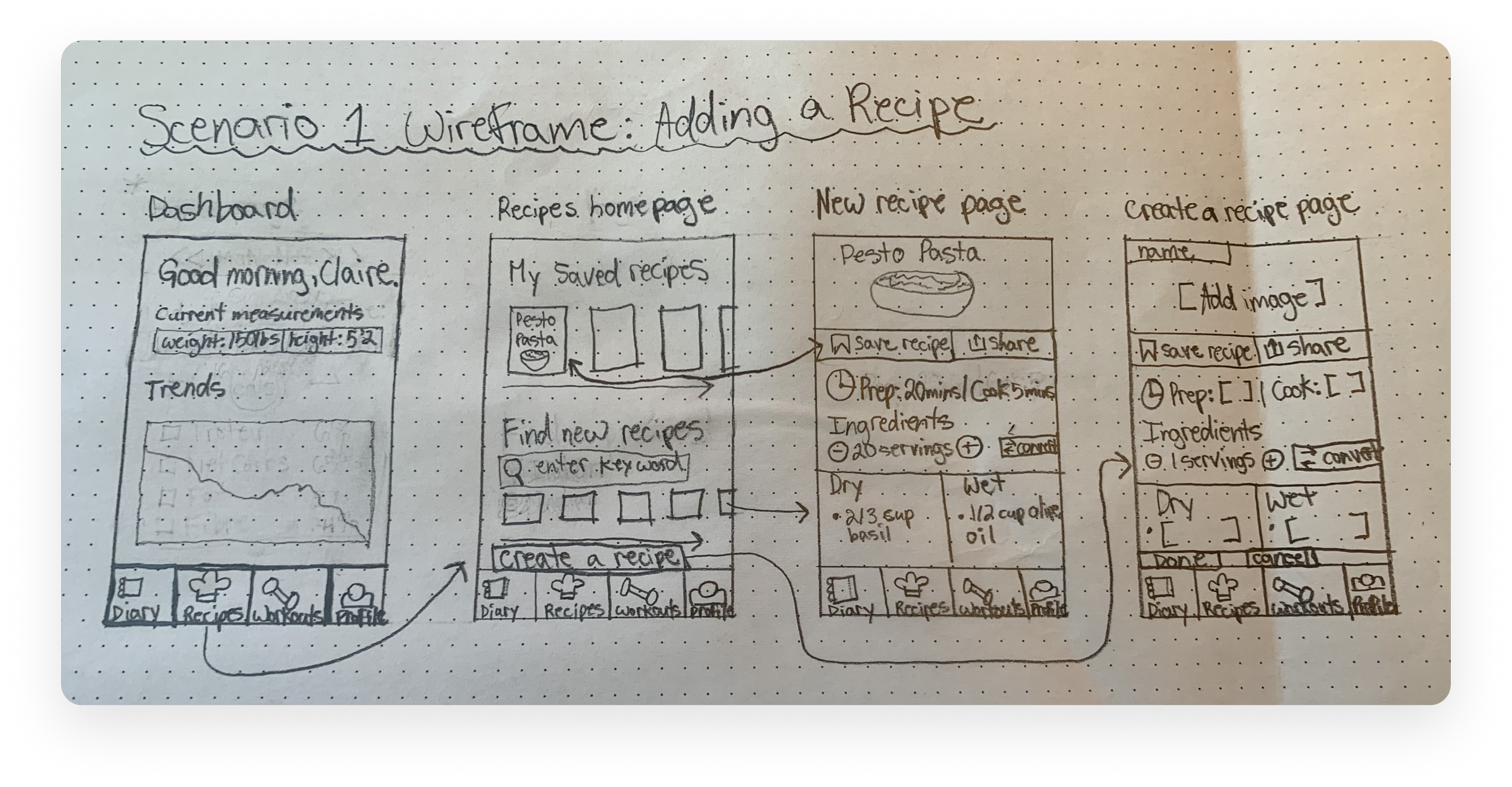
I sketched wireframes in a sequential flow to guide users through the process of discovering, viewing, and creating recipes. The sketches helped the user flow become clearer, more organized, and easier to evaluate before moving into low-fidelity wireframes. Visually mapping the journey and establishing structure early identified how users would navigate between screens, what information needed the most emphasis, and where interactive elements should consistently appear. The wireframes show a clear narrative using layout, hierarchy, and visuals. The left-to-right layout creates a natural progression from the dashboard, helping viewers understand the flow of the experience.
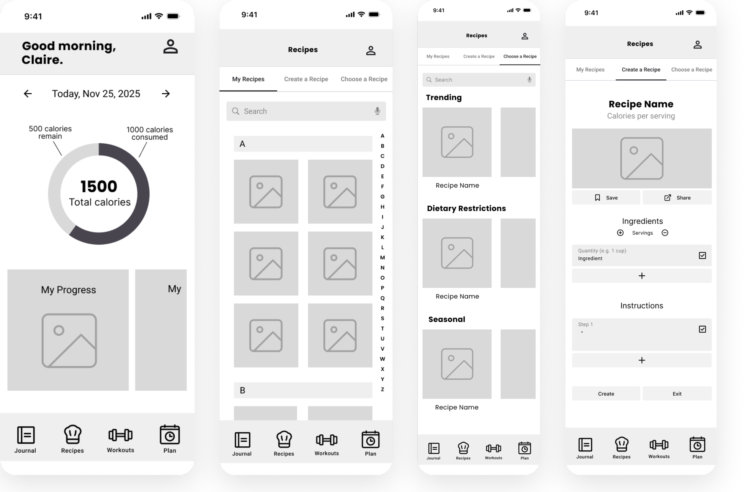
LOW FIDELITY
Driven by curiosity and built on purpose, this is where bold thinking meets thoughtful execution. Let’s create something meaningful together.
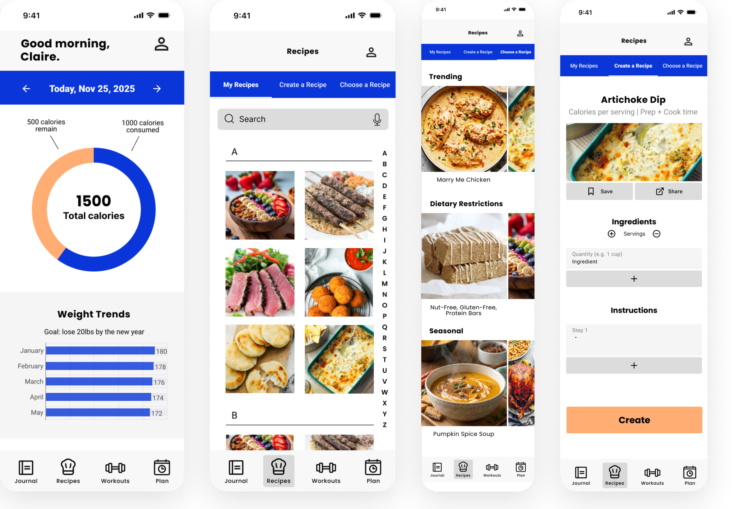
HIGH FIDELITY
I created high fidelity wireframes with the brand's identity and accessibility in mind. I developed these with brand identity in mind by keeping the original royal blue colour to preserve familiarity for existing users while adding an orange secondary colour for contrast and emphasis. The consistent colour scheme helped the redesign feel like an evolution of the product rather than an entirely new experience.
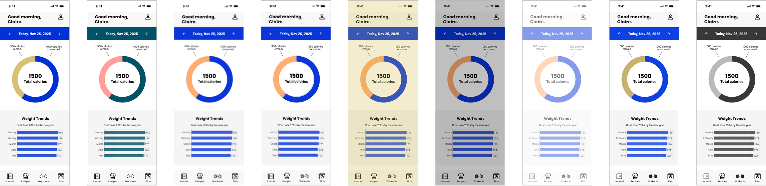
ACCESSIBILITY
I conducted accessibility tests through Stark - Contrast and Accessibility Checker and made data-informed decisions accordingly. I tested contrast, typography, touch targets, and did a vision simulator while creating the high fidelity wireframe. I made data informed decisions by adjusting the colour and size of fonts and buttons based on the suggestions of the plugin. These decisions resulted in the plugin confirming fully accessible wireframes, demonstrating my successful application of project objectives.
The redesign transformed MyFitnessPal's Plan Your Meal experience into a more accessible and intuitive interface by applying inclusive design principles throughout the design process. Research identified navigation, visibility, and accessibility as the primary pain points. These insights guided every design decision—from restructuring the information hierarchy to improving colour contrast, typography, and touch targets.
RESULTS
Redesigned an existing feature using an inclusive design process.
Applied WCAG accessibility principles to improve usability.
Created wireframes, low-fidelity, and high-fidelity prototypes in Figma.
Developed a more intuitive navigation and visual hierarchy for meal planning.
PROJECT OUTCOMES
Key Takeaway