ReFIND
Second-hand style with sustainability in sight.
THE PROBLEM
Environmentally conscious shoppers want to make more sustainable fashion choices, but it can be difficult to understand the impact of their purchases and find second-hand options that align with their values.
THE SOLUTION
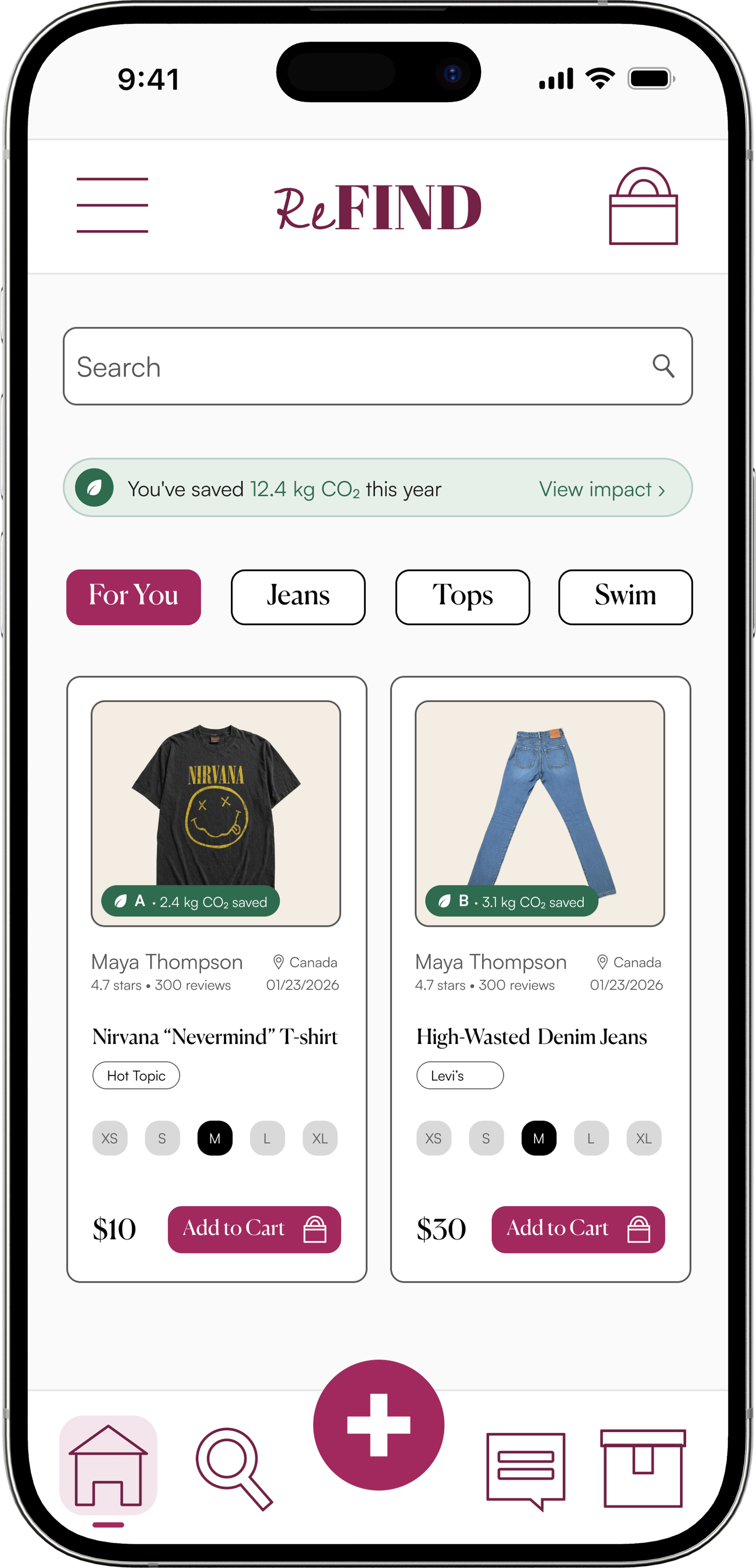
ReFIND highlights sustainability by making the impact of each purchase transparent so shoppers can feel satisfied with their purchase.
RESEARCH INSIGHTS
I focused on understanding the motivations behind thrifting culture so the product could communicate value beyond simply buying and selling clothes. Through second-hand research, I identified three major drivers to shape the communication goals of the app.
Affordability & Value
1
Thrifting lets shoppers buy clothing at lower prices while finding higher- quality or valuable items, helping them justify their purchases and save money.
Ethical & Sustainable Values
2
People thrift because it aligns with their environmental and moral beliefs against fast fashion brands and clothing waste.
Self Expression & Social Culture
3
Thrifting enables individuals to find unique clothing, express their identity, and feel connected to a community of people sharing similar values and interests.
COMPETITIVE ANALYSIS
I performed a competitive analysis to identify a design opportunity. Results indicated a gap in sustainable visibility on resell/thrifting platforms such as Poshmark and Depop.
Poshmark
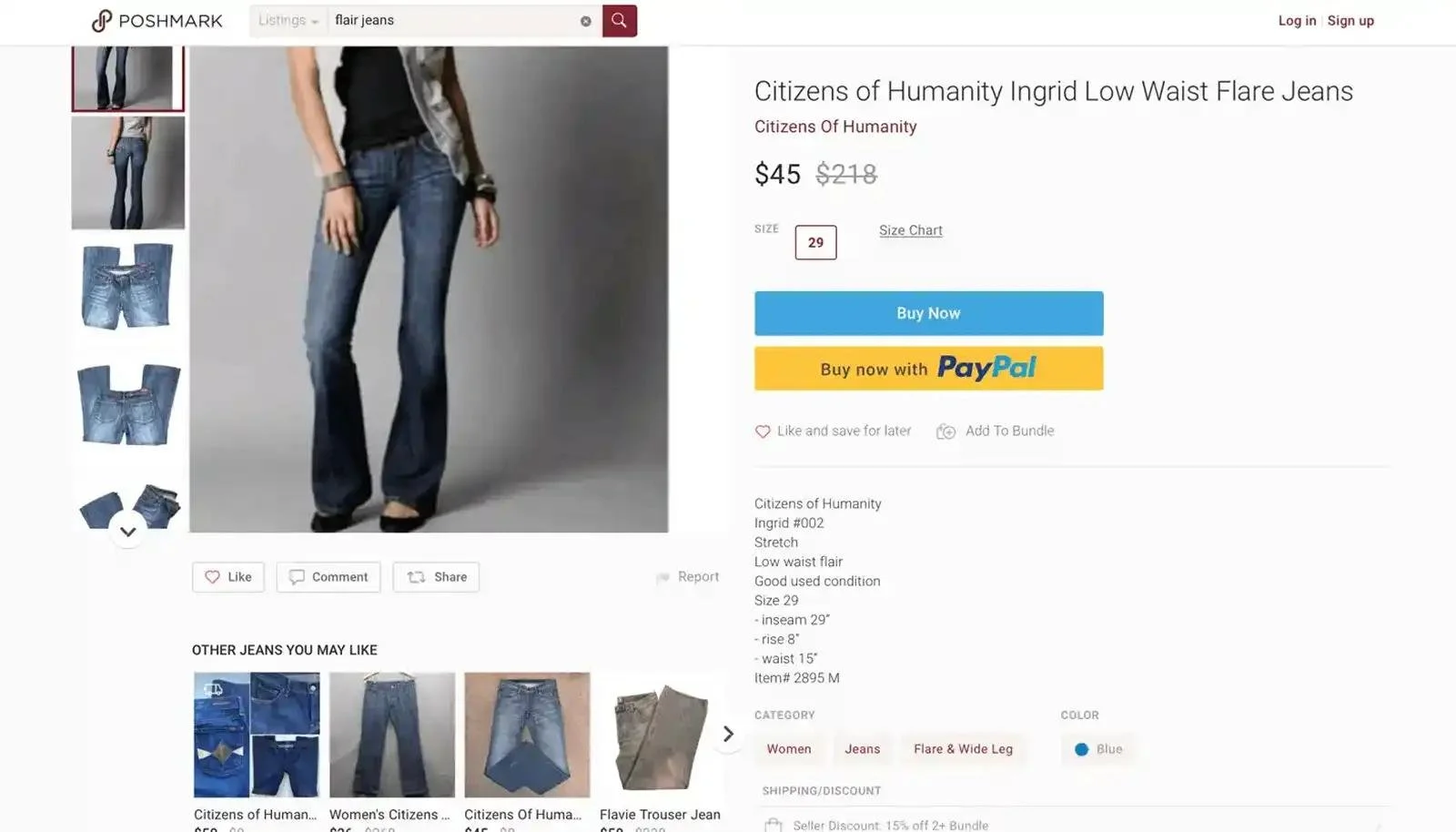
Sustainability information depends largely on seller-provided product details rather than a consistent environmental identifier.
Poshmark surfaces information such as price, size, brand, condition, category, colour, description, and purchase actions. They don't visibly surface a standardized sustainability badge or environmental-impact indicator.
Depop
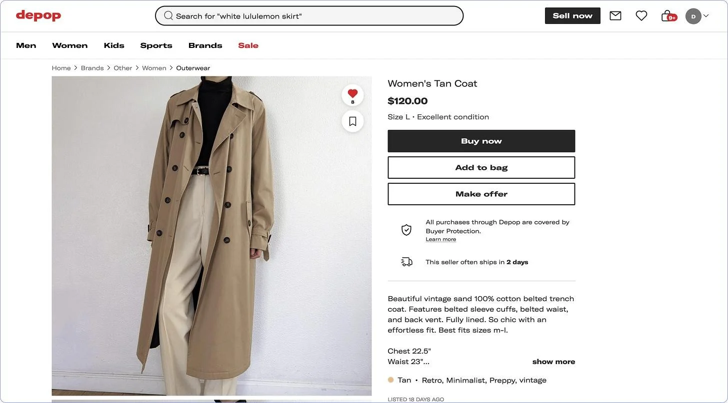
Sustainability may be communicated through product or seller descriptions, but environmental information isn't necessarily prominent at the point of discovery.
Depop listings prominently communicate information such as price, size, condition, brand, colour and seller description. Sellers can discuss sustainability themselves but the listing demonstrates how that information can reside within the seller's description rather than a standardized environmental-impact indicator.
ReFIND
Features
Sustainability Indicators
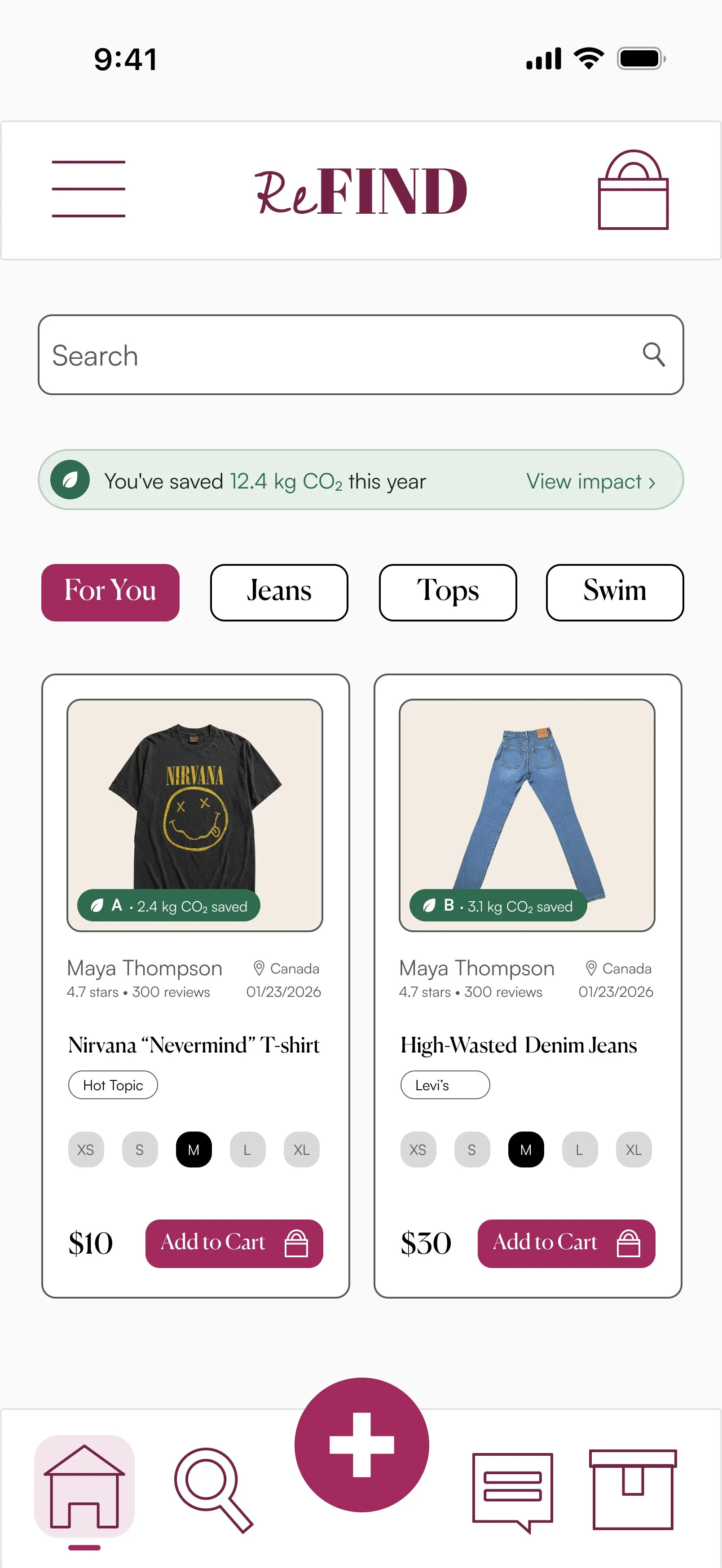
Sustainability indicators make the environmental benefits of second-hand shopping visible at the point of discovery.
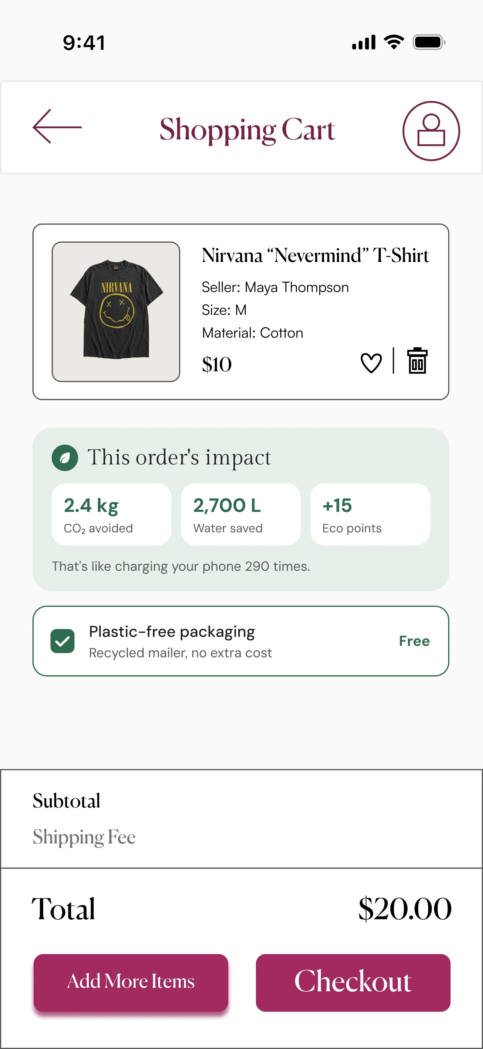
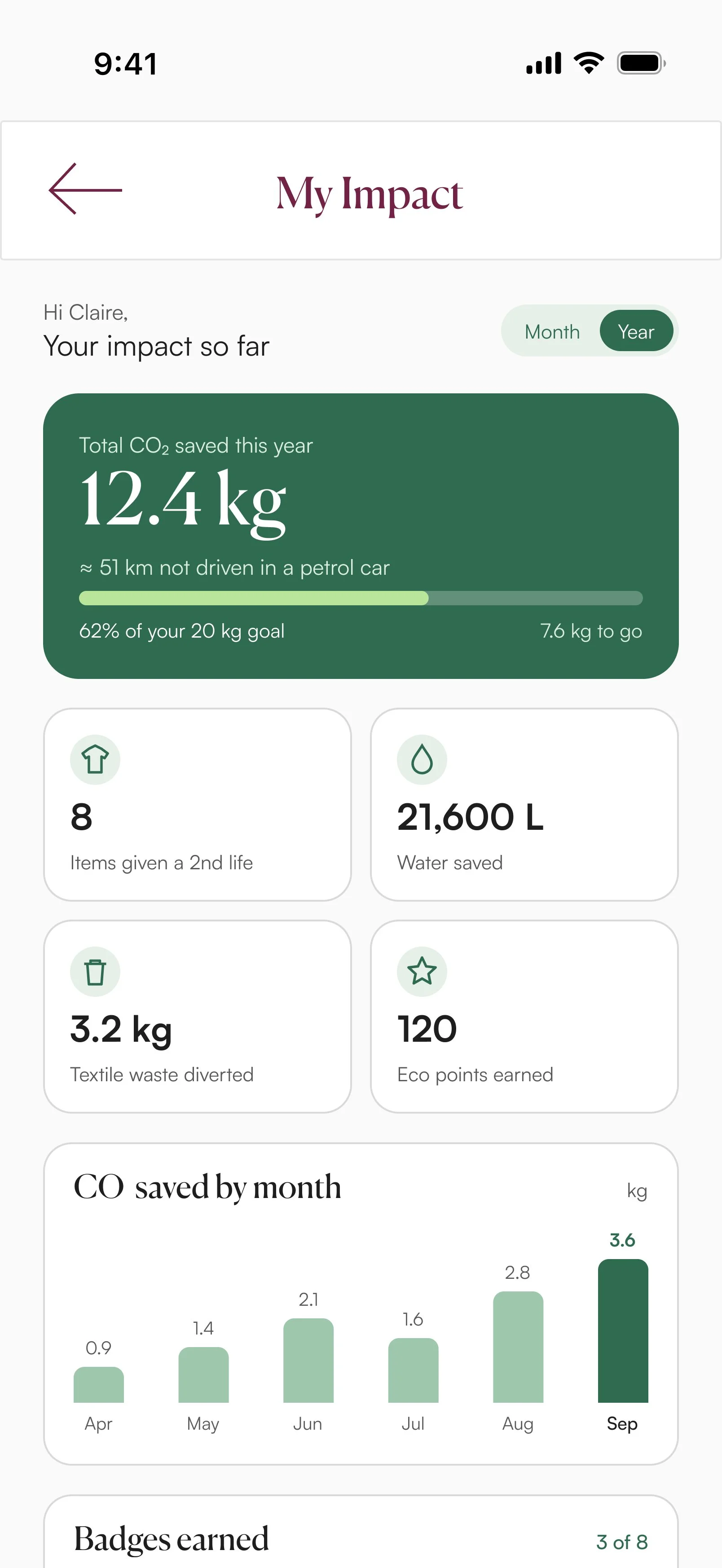
The Sustainability Impact Dashboard visualizes the impact of a user’s second-hand purchases by tracking and revealing how their shopping habits contribute to more sustainable consumption.
Personal Impact Dashboard
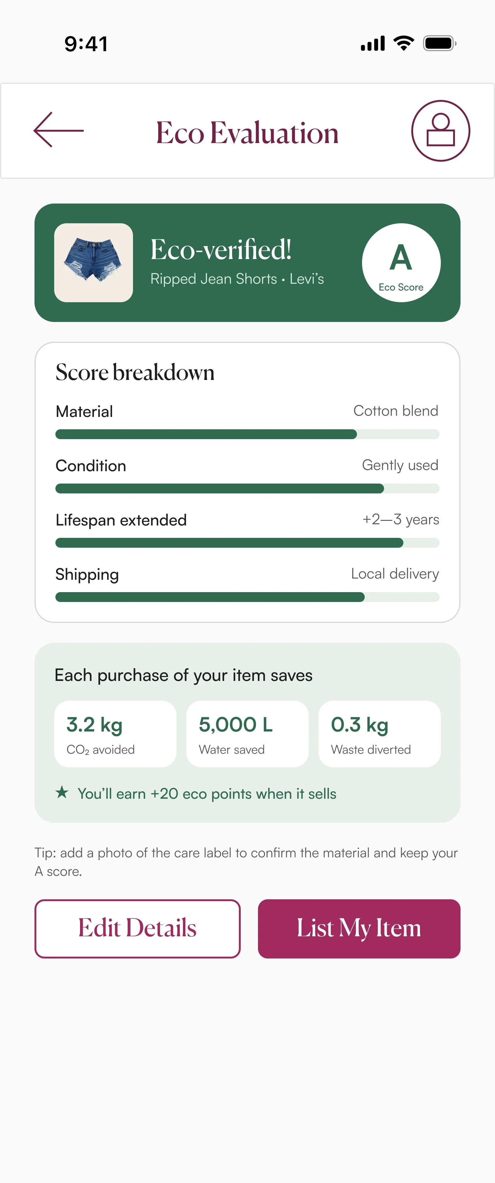
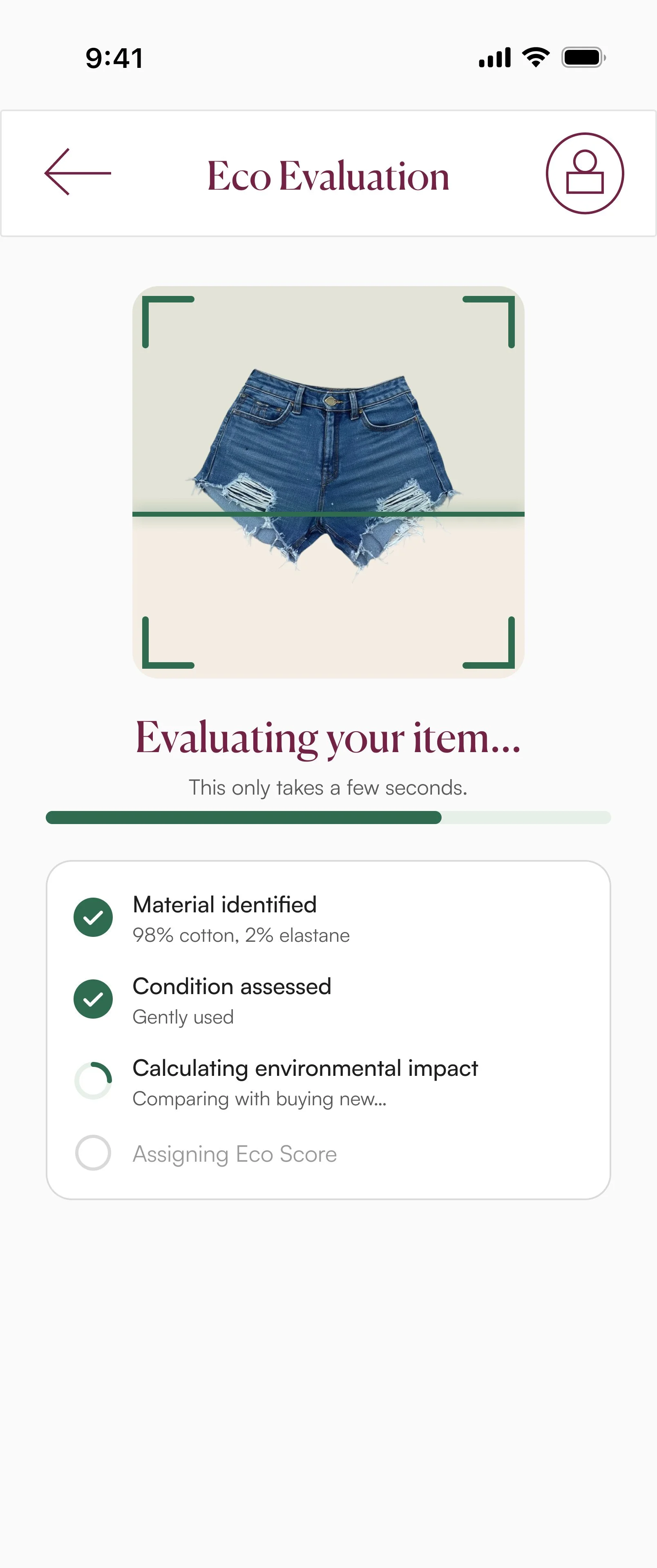
Eco Verification scans, assesses, and rates an item of clothing including details about its materials and condition. This gives buyers a clearer understanding of each item’s environmental qualities and helps them make more informed purchasing decisions.
Eco Verification
UI KIT
The final UI kit created a strong visual narrative balancing brand personality with usability. Hierarchy, colour, typography, and interaction design easily guided users through the app and reinforced its identity as a modern, sustainability-driven thrifting platform.
ICONS & BUTTONS
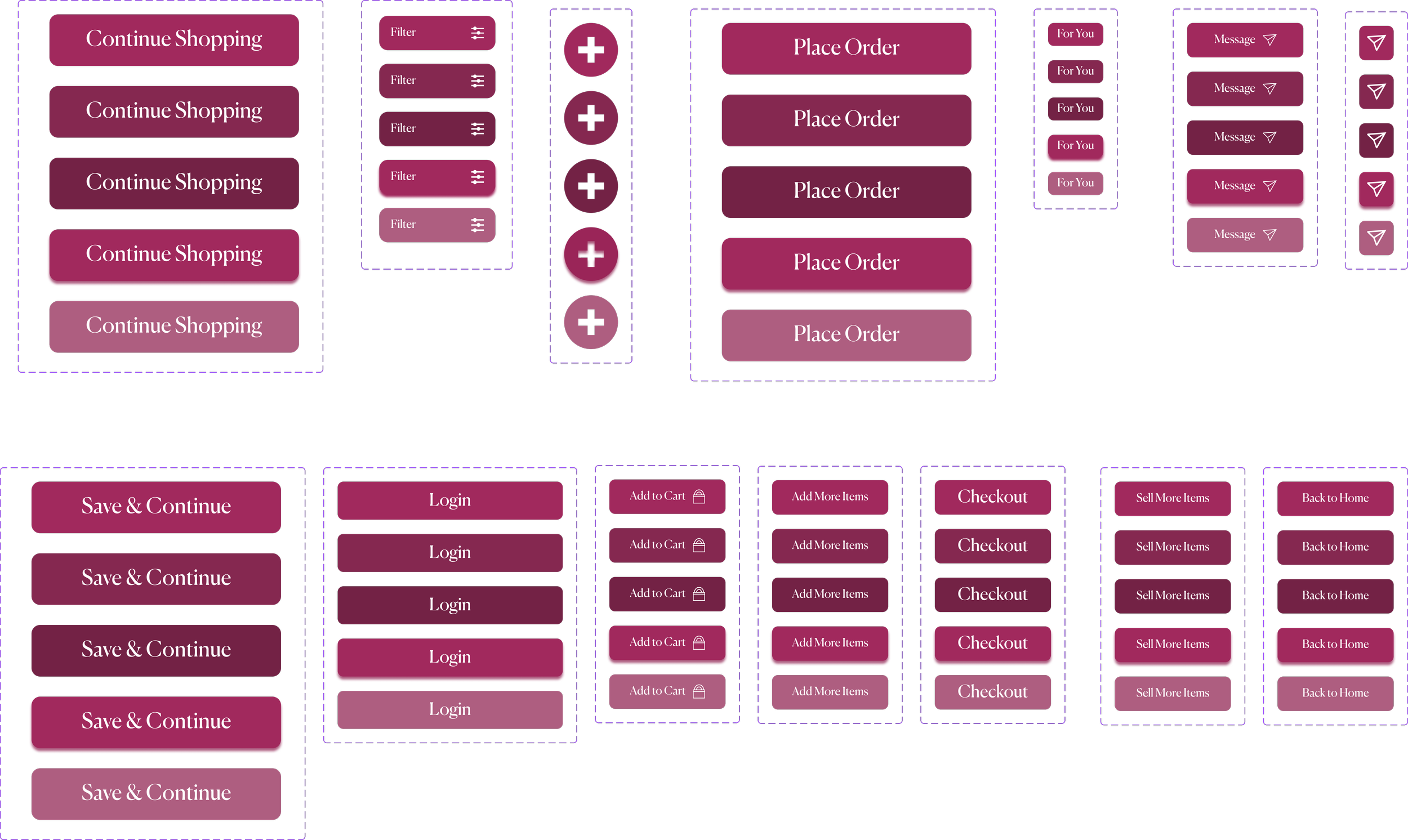
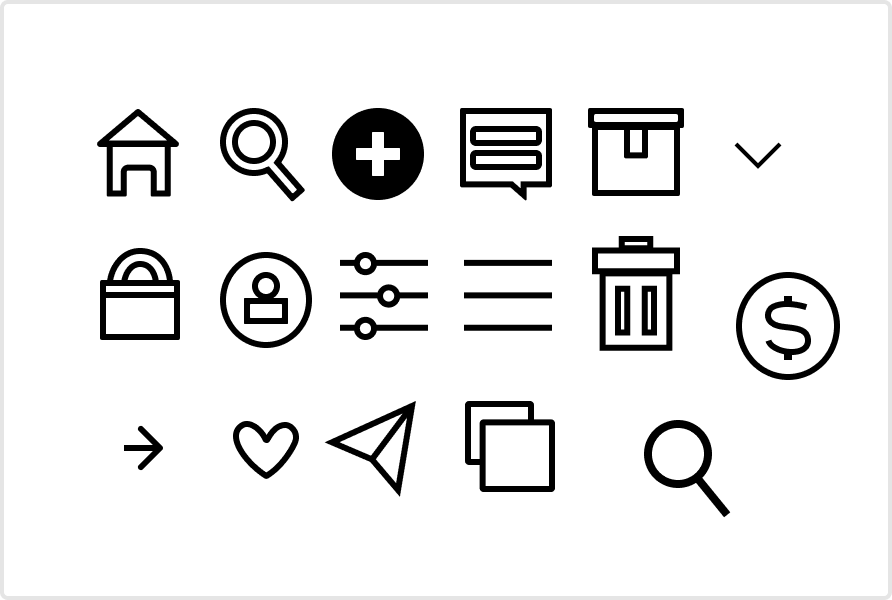
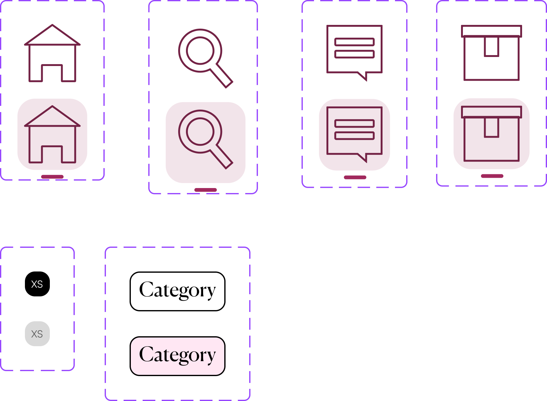
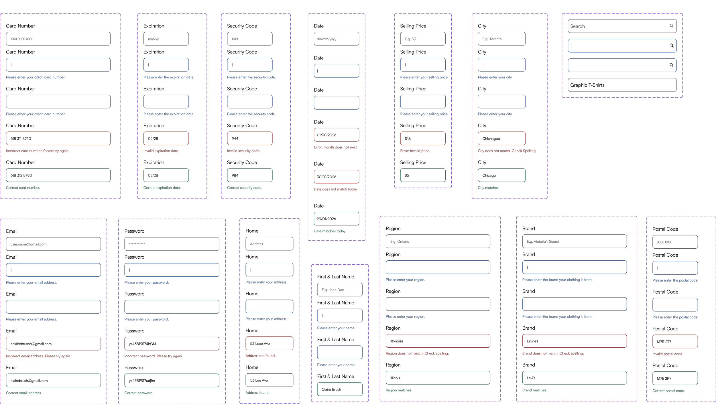
I designed consistent icons, and forms and buttons with the same typography, spacing, and colour to guide users through searching, purchasing, and selling items.
COLOUR PALETTE
Primary Palette
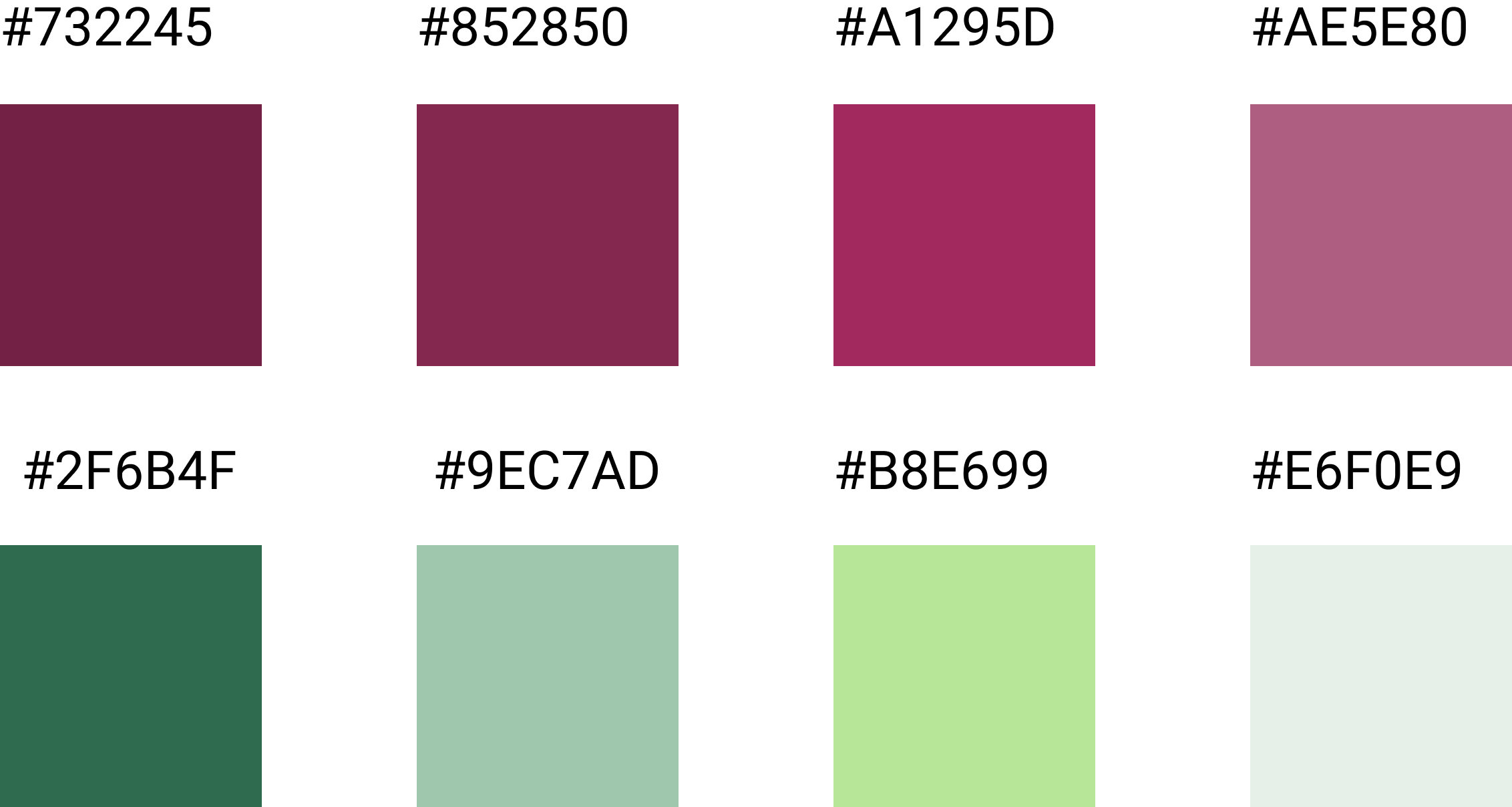
Deep rose tones reinforced the brand identity and button states while the contrasting green shades highlighted the sustainability elements.
Secondary & Active/NeutralPalette
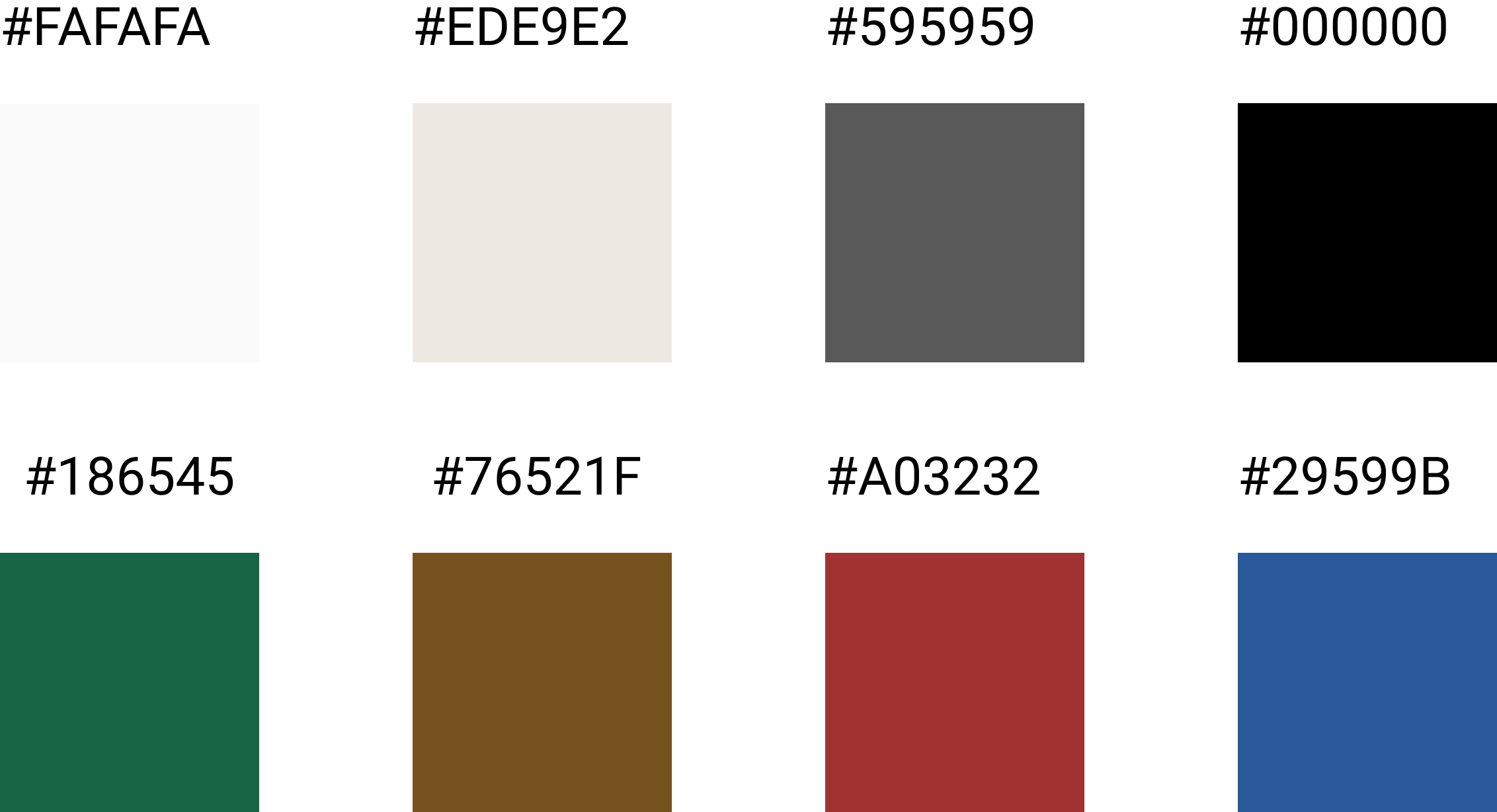
The neutral backgrounds emphasized product imagery, and active colours communicated approvals, warnings, errors, and typing states.
TYPOGRAPHY
I used six heading and three body text variations to establish a clear information hierarchy across screens and a distinction between primary actions, product information, and supporting details. I selected Canela for headings to create a fashionable and editorial feel reflecting the individuality and curated nature of thrifting culture. Satoshi provided clean readability for body text and form interactions.


PROTOTYPE
I translated the research insights and UI Kit into a full user experience. The prototype maintained consistent visual identity, tone, and interaction style using the UI Kit. Product browsing screens emphasized discovery and individuality, while selling flows were designed to feel simple, welcoming, and community-driven. Notification banners, button labels, and interface copy maintained a supportive and conversational tone that reflected the sustainable and peer-to-peer nature of the platform. Consistency in spacing, hierarchy, icon usage, and navigation patterns helped create a seamless experience that felt recognizable across every part of the app.
RESULTS
Through secondary research and iterative design, ReFIND addressed the key barriers to making sustainable shopping visible. The final prototype combined buying and selling into one streamlined marketplace, allowing users to browse, list items, message sellers, and complete purchases within a consistent experience. By prioritizing trust, simplicity, and community, the design made sustainable shopping feel more approachable for everyday users.